Entry tags:
Coexistence Alpha: a responsive mobile and desktop overlay for Dreamwidth
UPDATE 2018/12/4: QUESTION 1: Yes, this respects your colours; I just like green.
UPDATE 2019/2/6: QUESTION 2: Yes, this sat fallow for a while, but no longer. We have a second RC.
You Want Mobile Dreamwidth, Artie? You Got It.
Coexistence Alpha: a mobile-friendly CSS patchset for Neutral Good - v0.846 RELEASE CANDIDATE TWO
(2019/2/6)
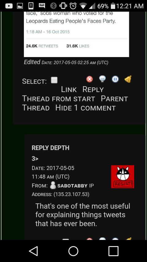
This is a fully-responsive mobile-ready theme modification layer intended to make Dreamwidth's default style fully functional on both mobile and desktop devices wherever it can be applied. Features include journal and reading pages with near-zero horizon scrolling on mobile, including in long comment reply cascades, and more-comfortable comment creation, including on iOS.
To install: Choose style "Neutral Good" for "Practicality" in the journal style selector. Copypasta all of the linked CSS into the Advanced Seettings Custom CSS box, and save. (This may require a desktop device.) Apply "your style" to everything you can.
This build includes Navbar 2, which is mostly cosmetic but somewhat mobile-aware upgrade of the Navbar.
0.846rc2: issues with proto-emoji/"subject icon" functionality triggering horizontal scrolling.
0.845alpha: issues with external image size limits (to prevent horizontal scrolling) fixed.
0.844alpha: issues with qrform select box placement.
0.843alpha: some divs in RSS feeds disallow whitespace wrap, causing horizontal scrolling. I'm as surprised as you. Overridden.
0.842beta: Small calendar module cleanup on desktop views. No bugs externally reported, last three builds. We are now in beta.
0.841alpha: Previous N/Next N links given more height.
0.840alpha: Cleaned up code a lot, particularly comment handling on mobile, which gives you even more text entry room now.
0.834alpha: Individual-comment reply form (reached via inbox reply) cleanup. Small Navbar 2 button regularisation on Reading page view.
0.833alpha: Fixes a small border problem, alignment issue on Reading page.
0.832alpha: Rebuilds Navbar 2 from the top down, and adds some mobile awareness, again mostly cosmetic, but hopefully a bit more visual coherence nonetheless.
0.830alpha: Hands body font size back to user preferences, removing the hardcoded size used until now. The system default is 1em. This unit (em) is unreliable across browsers; I have changed my body type size to 14px and recommend the use of a px-based size generally.![[personal profile]](https://www.dreamwidth.org/img/silk/identity/user.png) solarbird_testbed is always running the bleeding edge build or later (when code changes are in progress).
solarbird_testbed is always running the bleeding edge build or later (when code changes are in progress).
.82x fixes included Navbar 2 working better on Android browsers (Login panel is still a bit of a mess but I don't care, all that's going away in Navbar 3 anyway), comment thread depth indicators on mobile working even without subject lines, various overprint issues, and so on.
.81x fixes included user left-right selection of icon placement is honoured correctly again. As are icon sizes except on mobile comments where you're forced to "smallest" regardless. Also, the implementation was improved.
And if you see issues, please give me a screenshot and tell me your browser and OS. Thanks!
UPDATE 2019/2/6: QUESTION 2: Yes, this sat fallow for a while, but no longer. We have a second RC.
Coexistence Alpha: a mobile-friendly CSS patchset for Neutral Good - v0.846 RELEASE CANDIDATE TWO
(2019/2/6)
This is a fully-responsive mobile-ready theme modification layer intended to make Dreamwidth's default style fully functional on both mobile and desktop devices wherever it can be applied. Features include journal and reading pages with near-zero horizon scrolling on mobile, including in long comment reply cascades, and more-comfortable comment creation, including on iOS.
To install: Choose style "Neutral Good" for "Practicality" in the journal style selector. Copypasta all of the linked CSS into the Advanced Seettings Custom CSS box, and save. (This may require a desktop device.) Apply "your style" to everything you can.
This build includes Navbar 2, which is mostly cosmetic but somewhat mobile-aware upgrade of the Navbar.
0.846rc2: issues with proto-emoji/"subject icon" functionality triggering horizontal scrolling.
0.845alpha: issues with external image size limits (to prevent horizontal scrolling) fixed.
0.844alpha: issues with qrform select box placement.
0.843alpha: some divs in RSS feeds disallow whitespace wrap, causing horizontal scrolling. I'm as surprised as you. Overridden.
0.842beta: Small calendar module cleanup on desktop views. No bugs externally reported, last three builds. We are now in beta.
0.841alpha: Previous N/Next N links given more height.
0.840alpha: Cleaned up code a lot, particularly comment handling on mobile, which gives you even more text entry room now.
0.834alpha: Individual-comment reply form (reached via inbox reply) cleanup. Small Navbar 2 button regularisation on Reading page view.
0.833alpha: Fixes a small border problem, alignment issue on Reading page.
0.832alpha: Rebuilds Navbar 2 from the top down, and adds some mobile awareness, again mostly cosmetic, but hopefully a bit more visual coherence nonetheless.
0.830alpha: Hands body font size back to user preferences, removing the hardcoded size used until now. The system default is 1em. This unit (em) is unreliable across browsers; I have changed my body type size to 14px and recommend the use of a px-based size generally.
solarbird_testbed is always running the bleeding edge build or later (when code changes are in progress)..82x fixes included Navbar 2 working better on Android browsers (Login panel is still a bit of a mess but I don't care, all that's going away in Navbar 3 anyway), comment thread depth indicators on mobile working even without subject lines, various overprint issues, and so on.
.81x fixes included user left-right selection of icon placement is honoured correctly again. As are icon sizes except on mobile comments where you're forced to "smallest" regardless. Also, the implementation was improved.
And if you see issues, please give me a screenshot and tell me your browser and OS. Thanks!


Page 1 of 2